How I Restored and Colour Matched a Polychrome Frame
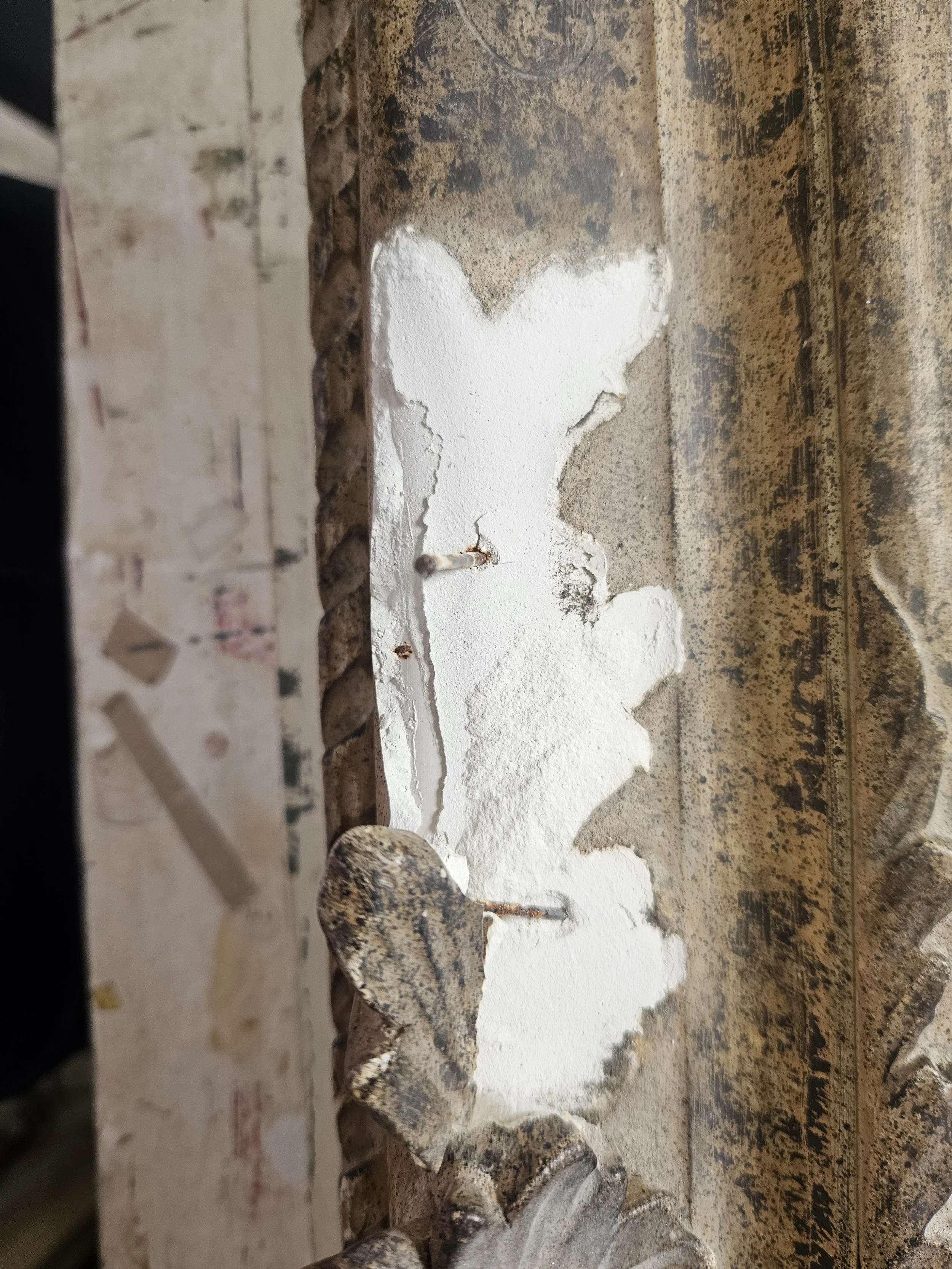
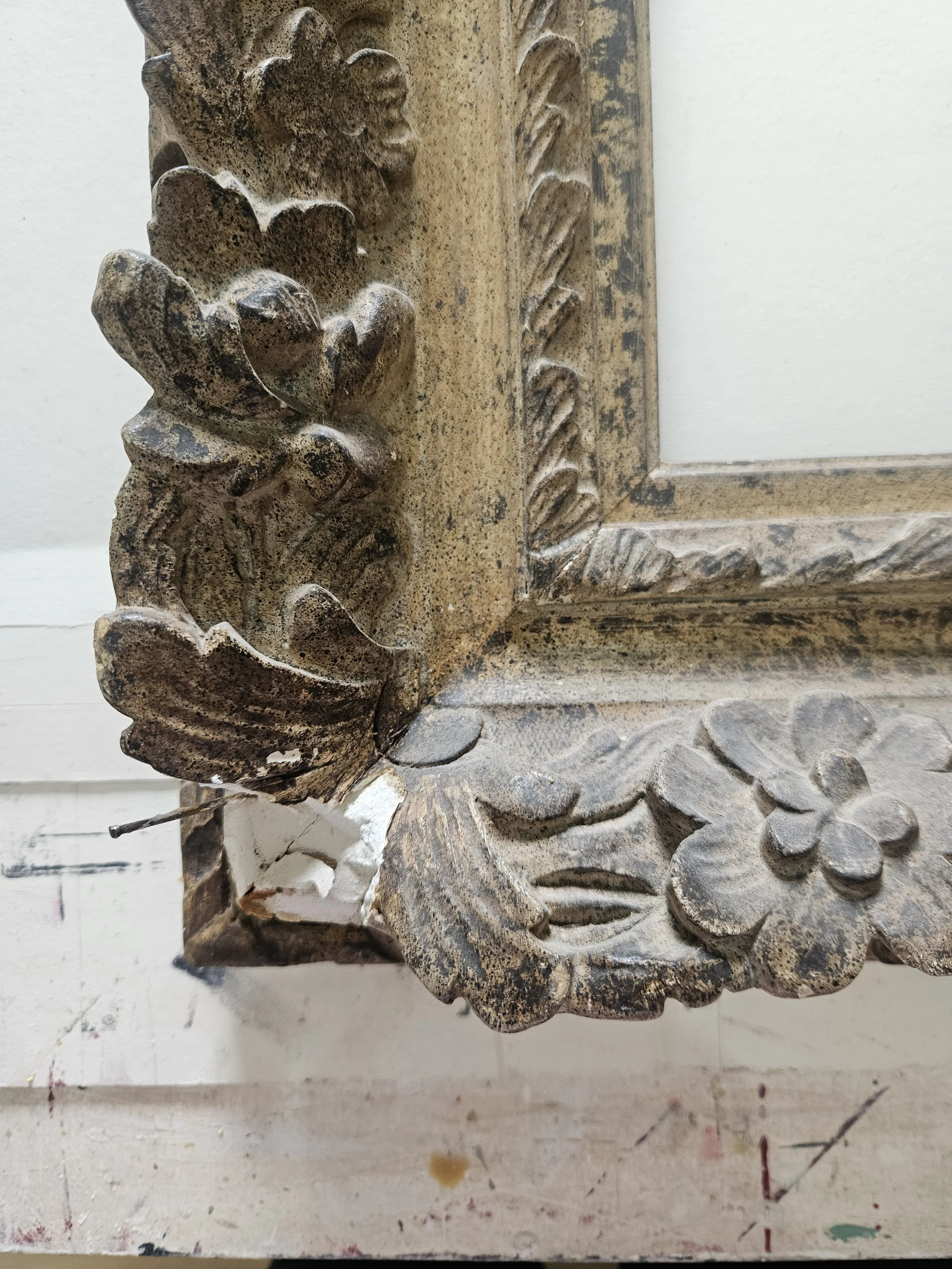
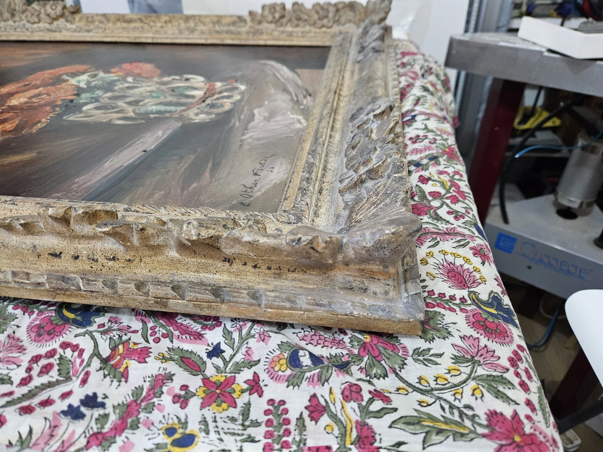
Sometime last summer, a client from Edinburgh brought me a beautiful ornate frame to restore. It had unfortunately been dropped and lost a significant amount of ornamentation from the lower section as well as the ropework around the outside. The drop (and age of the piece) had also resulted in some instability of the ornaments, which also had to be fixed and secured.
Below; pictures left to right- images with significant lost ornamentation, and my recreated ornaments before colour matching, and finally cracking found in other ornamentation on the frame which was filled to secure.
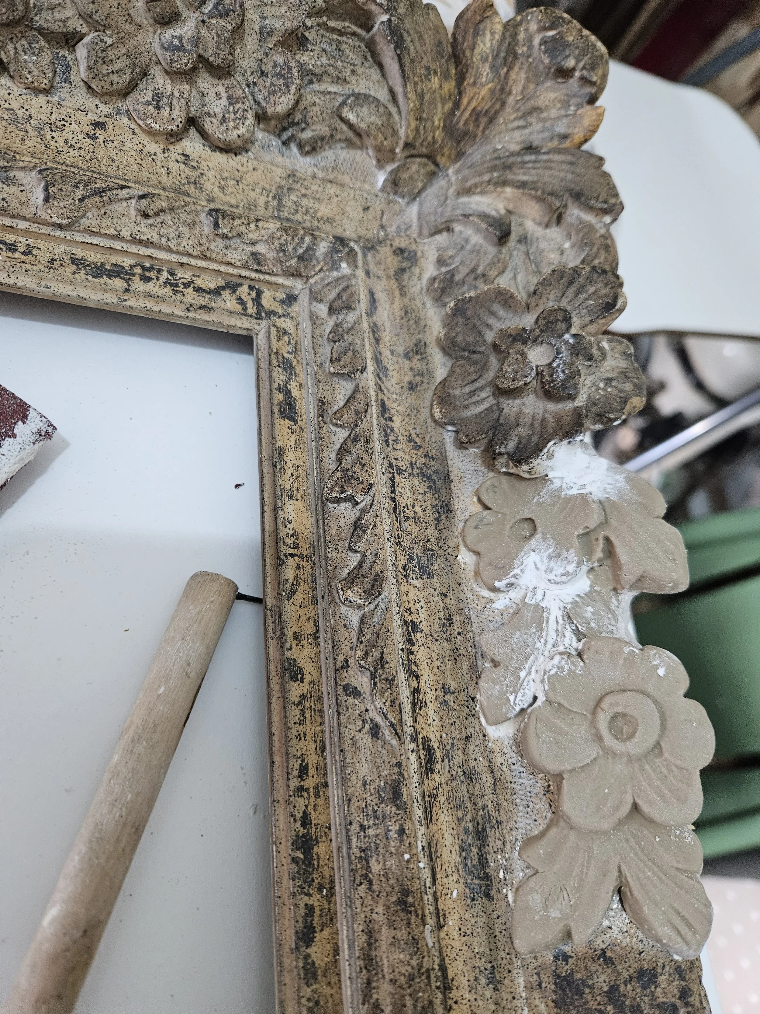
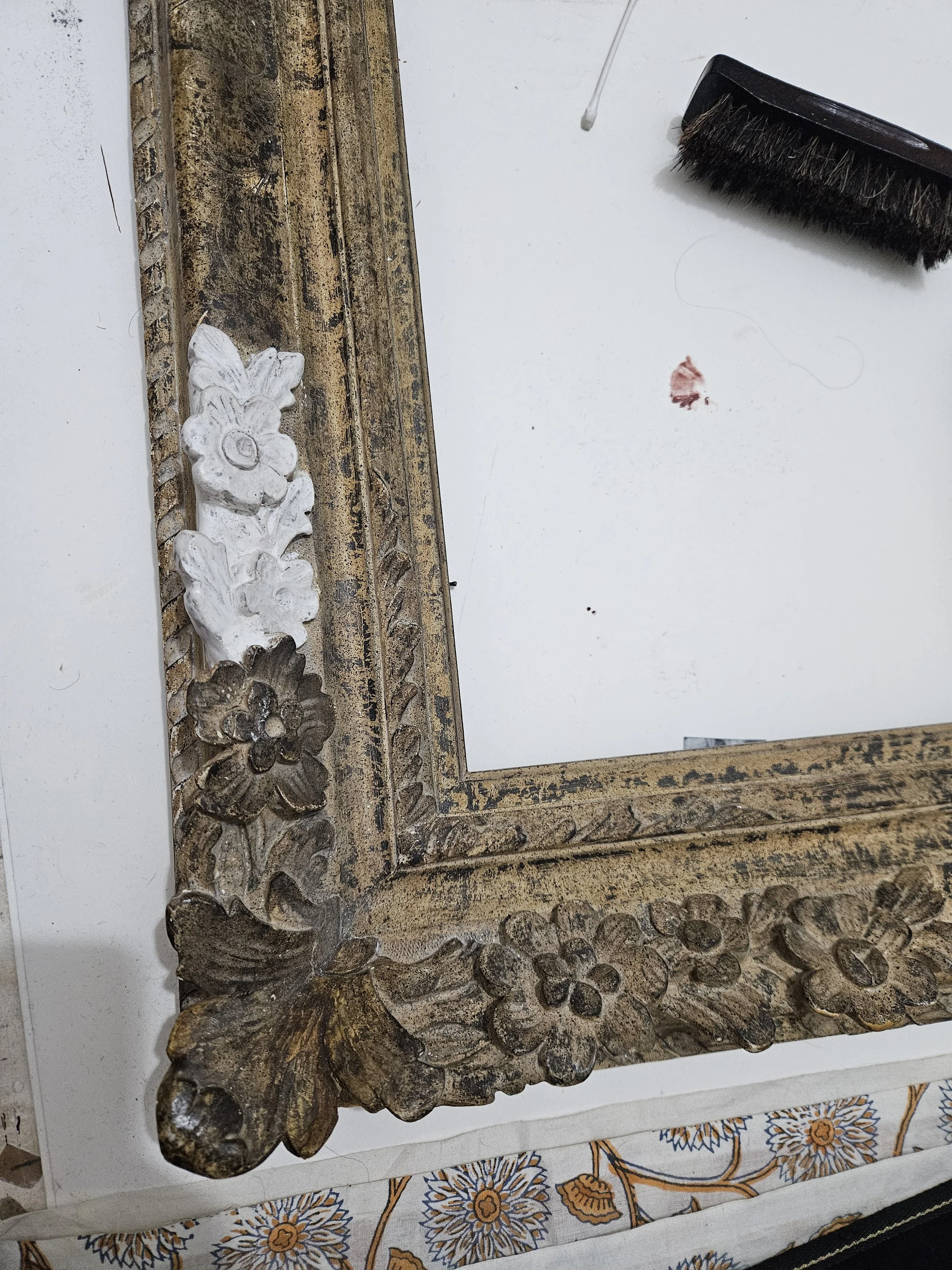

However replacing the ornaments, that for me, was the simple part. I then had to make it look the same as the rest.
When it comes to restoring antique polychrome frames, one of the trickiest challenges is matching that elusive aged finish — the one that looks like it's been quietly sitting in a grand house for two hundred years. Not yellowed, not chalky, not too warm, not too cold. Just… right.
Over time I've developed a method I keep coming back to, using Renaissance Wax as a binder with dry pigment powders. It gives me the control I need, and crucially, it's fully reversible — which matters when you're working on something that can't be undone.
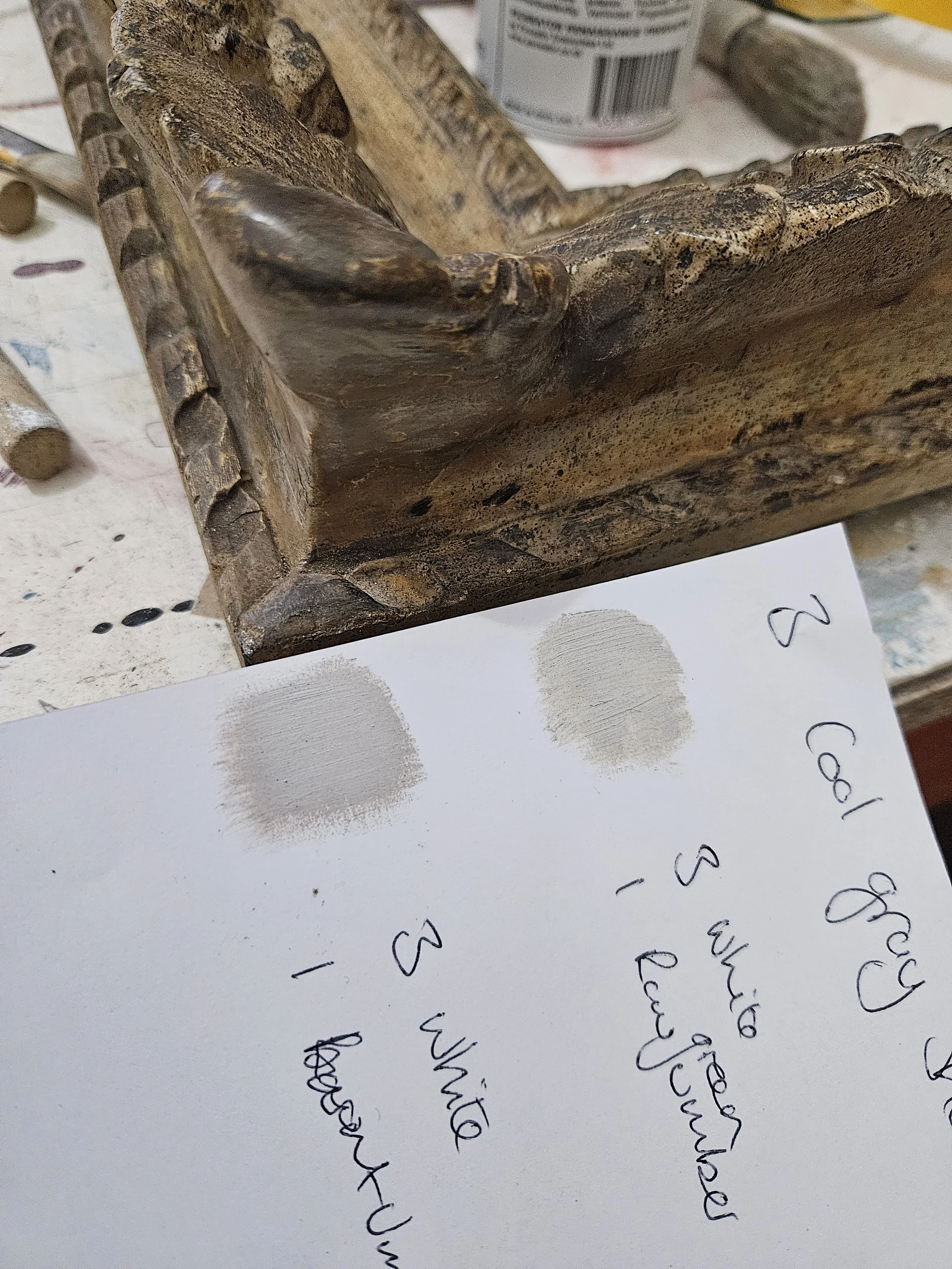
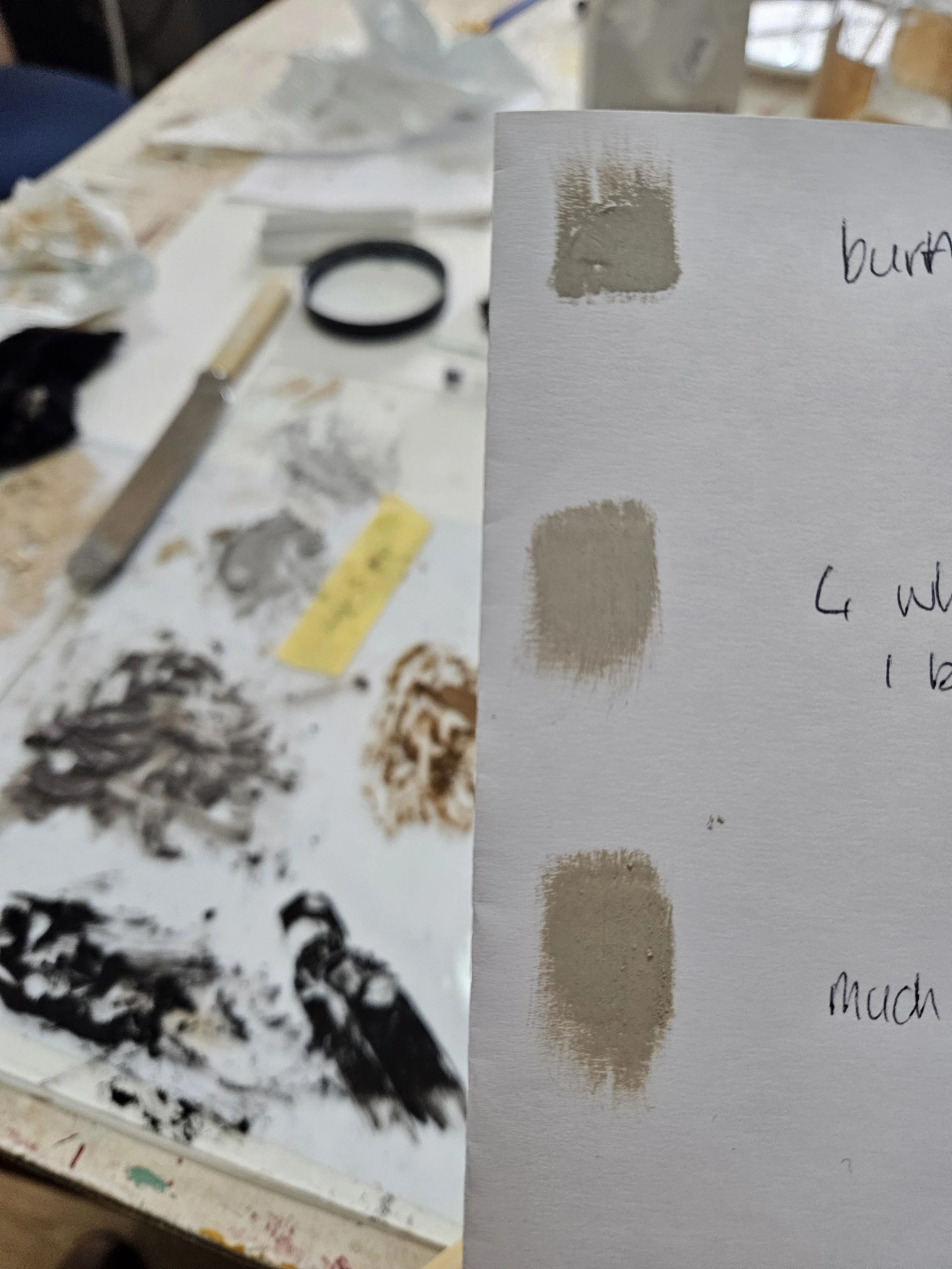
Above: this was my life. Finding the right mixes and layers. Starting with a base layer and building up
Why Renaissance wax?
The short answer: it's conservation-grade, stable, and forgiving.
Unlike paint or chalk paint, Renaissance Wax sits on the surface rather than soaking in. If I don't like the result, or the client changes their mind, I can remove it cleanly with white spirit and start again. That reversibility isn't just a nice-to-have — for me, it's a professional requirement. I'm not in the business of permanently altering antiques.
Building Up in Layers
It was important that I built the colours up in layers to achieve the final finish. Once I had chosen the base colours I would be working with; in my case Burnt Umber Titanium White, Raw Green Umber, Golden Ochre and Lamp Black it was a case of creating my layers from there and working in a set sequence
Base cream across the broad, flat areas — applied with a soft cloth or cotton pad, buffed gently
Warm brown mid-tones
Cool grey
Dark accents
Speckling (the finial flourish that ties it all together)
For carved details — flowers, leaves, any intricate ornament — I switch from cloth to a soft artist's brush to get into the recesses properly. Control matters much more than speed in those areas.
The golden rule throughout: thin layers, built gradually. You can always add more; it's much harder to take away.
This isn't fast work, and this method in particular rewards restraint. In fact the greatest time sink is calculating the colours required for each layer and when to stop each time. The temptation is always to keep adding — more warmth, more depth, more character — but the frames that turn out best are usually the ones where I stopped earlier than I thought I needed to.
If in doubt: less.
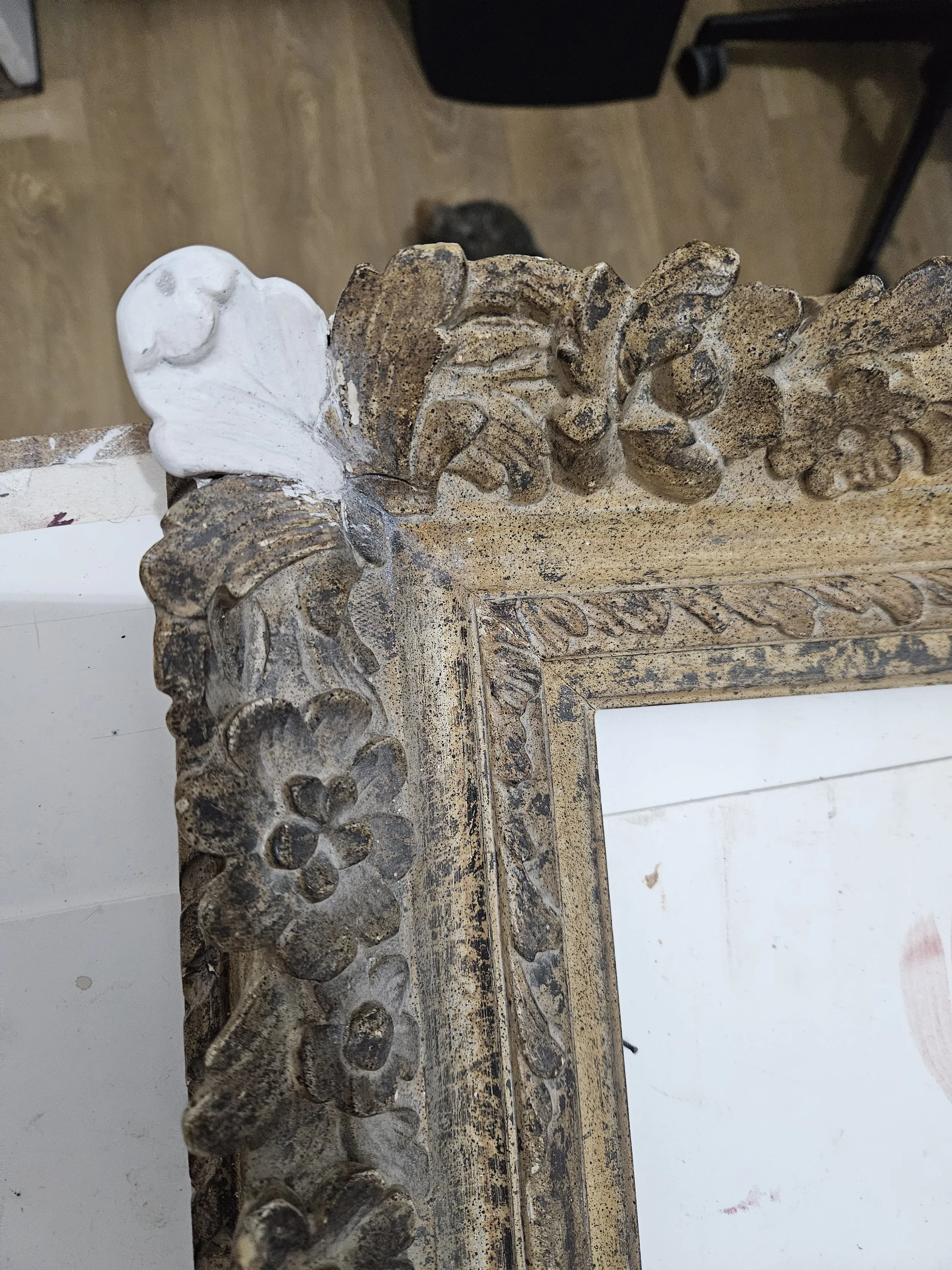
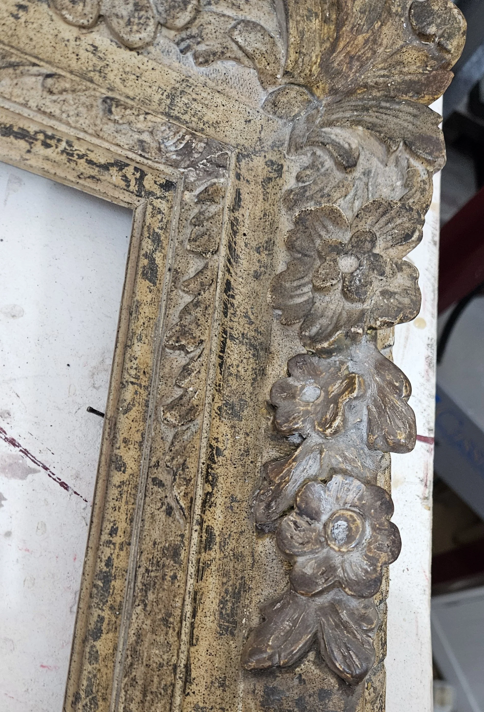
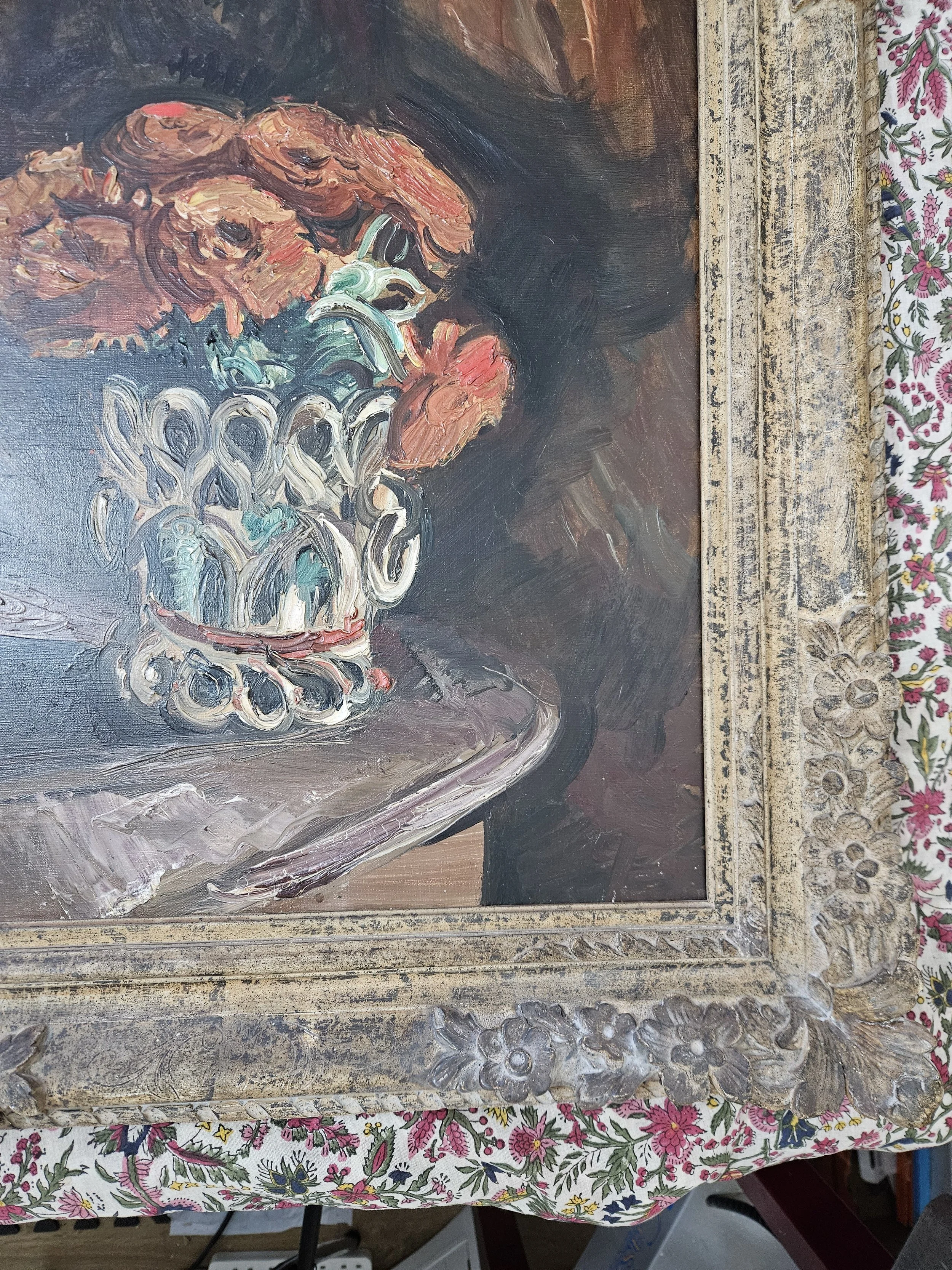
And I am truly happy with how this turned out.
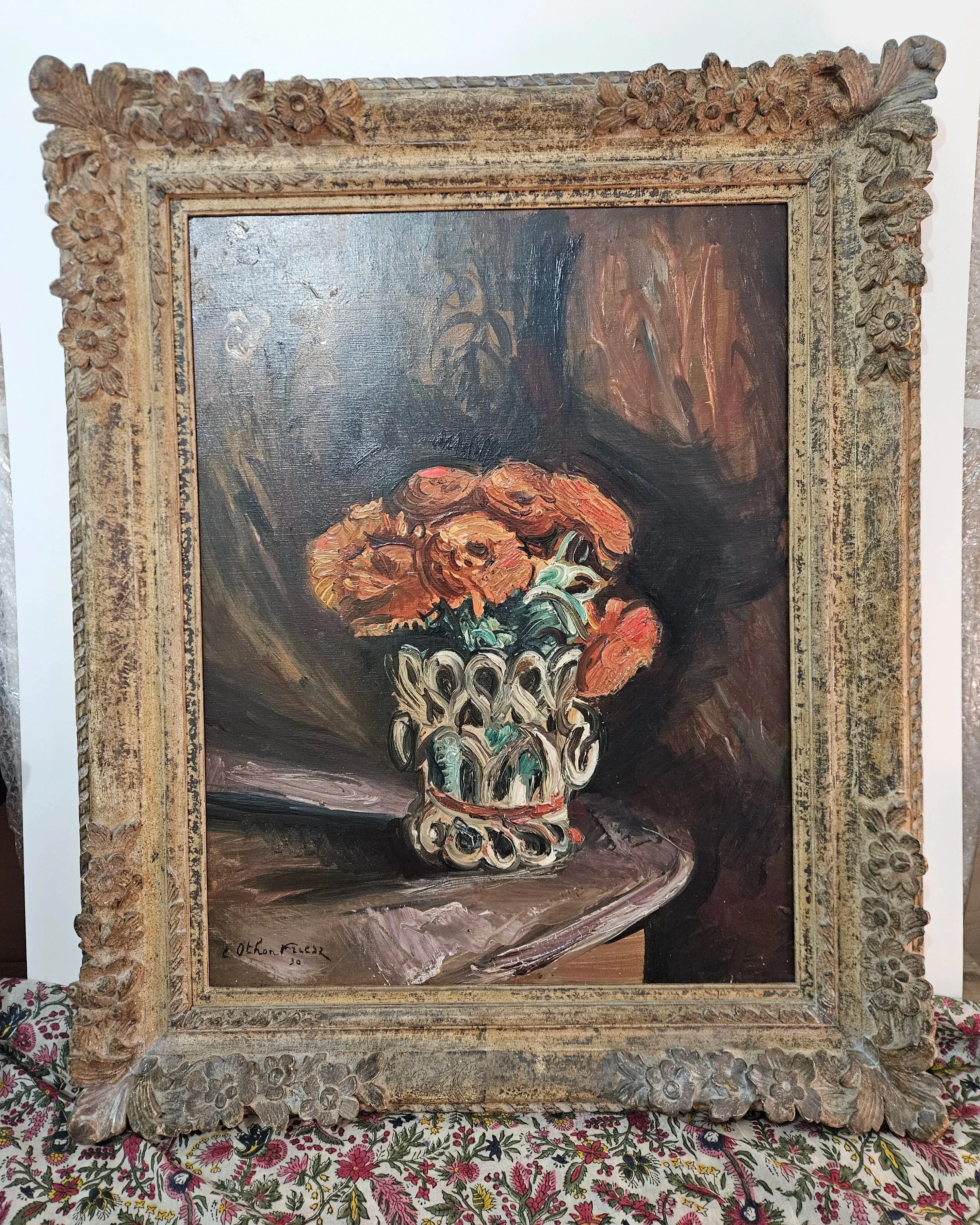
Ornamentation replaced and colour matched; ready to look good for many more years to come!